
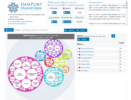
Bringing data to life through visualization is a powerful tool for discovery, and the ImmPort team is proud to add this capability to the ImmPort user experience. In one quick glance, users can now explore data in bubble chart format by research focus area, and drill down to find datasets by assay type.
Additionally, users can visualize other aspects of study data by clicking any numbers with a pie chart icon at the top of the Shared Data homepage. Clicking the Data Summary link at the top of the homepage also provides users yet another way to find data of interest.
ImmPort supports Findable, Accessible, Interoperable, and Reusable (FAIR) data principles. In addition to using descriptive metadata and persistent identifiers, data visualization is another way to help researchers find data that may lead to the next breakthrough.
Already have your own preferred tools for visualization? Use the bubble charts to find data of interest, download the associated data files, and run them through your own analysis tools. Interested in trying a new tool for analysis? Check out ImmPort Galaxy for completely free analysis and visualization tools. Just create a free account, accept the user agreement, and let the analysis begin.